
Introduction
This article demonstrate how we can create our own themes in silverlight.
We can create our own custom themes in silverlight application.
Step 1: Create one SilverlightClassLibrary
We have OwnTheme folder in our application, in that folder we have two
resourcedirectory files,
First AliceBlueTheme.xaml and SilverTheme.xaml.
AliceBlueTheme :
<Style
TargetType="Button">
<Setter
Property="Background"
Value="AliceBlue"/>
<Setter
Property="BorderThickness"
Value="1"/>
<Setter
Property="Foreground"
Value="Black"/>
<Setter
Property="BorderBrush"
Value="LightBlue"/>
</Style>
<Style
TargetType="Border">
<Setter
Property="Background"
Value="AliceBlue"/>
<Setter
Property="BorderBrush"
Value="LightBlue"/>
<Setter
Property="BorderThickness"
Value="1"/>
</Style>
<Style
TargetType="CheckBox">
<Setter
Property="Background"
Value="AliceBlue"/>
<Setter
Property="BorderBrush"
Value="AliceBlue"/>
<Setter
Property="Foreground"
Value="Black"/>
</Style>
<Style
TargetType="StackPanel">
<Setter
Property="Orientation"
Value="Vertical"/>
<Setter
Property="Background"
Value="AliceBlue"/>
</Style>
<Style
TargetType="HyperlinkButton">
<Setter
Property="Background"
Value="AliceBlue"/>
<Setter
Property="BorderBrush"
Value="AliceBlue"/>
<Setter
Property="BorderThickness"
Value="1"/>
<Setter
Property="Foreground"
Value="Black"/>
</Style>
<Style
TargetType="ComboBox">
<Setter
Property="Background"
Value="AliceBlue"/>
<Setter
Property="BorderThickness"
Value="1"/>
<Setter
Property="BorderBrush"
Value="AliceBlue"/>
</Style>
<Style
TargetType="ComboBoxItem">
<Setter
Property="Background"
Value="AliceBlue"/>
<Setter
Property="BorderBrush"
Value="AliceBlue"/>
<Setter
Property="BorderThickness"
Value="0.5"/>
<Setter
Property="Foreground"
Value="Black"/>
</Style>
SilverTheme :
<Style
TargetType="Button">
<Setter
Property="Background"
Value="Silver"/>
<Setter
Property="BorderThickness"
Value="1"/>
<Setter
Property="Foreground"
Value="Black"/>
<Setter
Property="BorderBrush"
Value="LightGray"/>
</Style>
<Style
TargetType="Border">
<Setter
Property="Background"
Value="Silver"/>
<Setter
Property="BorderBrush"
Value="Black"/>
<Setter
Property="BorderThickness"
Value="1"/>
</Style>
<Style
TargetType="CheckBox">
<Setter
Property="Background"
Value="Silver"/>
<Setter
Property="BorderBrush"
Value="Silver"/>
<Setter
Property="Foreground"
Value="Black"/>
</Style>
<Style
TargetType="StackPanel">
<Setter
Property="Orientation"
Value="Vertical"/>
<Setter
Property="Background"
Value="Silver"/>
</Style>
<Style
TargetType="HyperlinkButton">
<Setter
Property="Background"
Value="Silver"/>
<Setter
Property="BorderBrush"
Value="Silver"/>
<Setter
Property="BorderThickness"
Value="1"/>
<Setter
Property="Foreground"
Value="Black"/>
</Style>
<Style
TargetType="ComboBox">
<Setter
Property="Background"
Value="Silver"/>
<Setter
Property="BorderThickness"
Value="1"/>
<Setter
Property="BorderBrush"
Value="Silver"/>
</Style>
<Style
TargetType="ComboBoxItem">
<Setter
Property="Background"
Value="Silver"/>
<Setter
Property="BorderBrush"
Value="Silver"/>
<Setter
Property="BorderThickness"
Value="0.5"/>
<Setter
Property="Foreground"
Value="Black"/>
</Style>
Step 2:
Now we have two other resourcedirectory file where we keep the path of our
crated themes
(AliceTheme and SilverTheme) as below,
Theme.Xaml :
<ResourceDictionary.MergedDictionaries>
<ResourceDictionary
Source="/CustomThemesinSilverlight;component/OwnThemes/AliceBlueTheme.xaml"/>
</ResourceDictionary.MergedDictionaries>
Theme1.xaml :
<ResourceDictionary.MergedDictionaries>
<ResourceDictionary
Source="/CustomThemesinSilverlight;component/OwnThemes/SilverThemes.xaml"/>
</ResourceDictionary.MergedDictionaries>
Step 3:
We have two classes in our silverlight application like,Silverthemeclass.cs and
Aliceblueclass.cs.
Silverthemeclass.cs :
public
class
SilverThemeClass:Theme
{
private static
Uri ThemeResourceUri =
new Uri("/CustomThemesinSilverlight;component/Theme1.xaml",
UriKind.Relative);
public SilverThemeClass()
: base(ThemeResourceUri)
{
}
public static
bool GetIsApplicationTheme(Application
app)
{
return GetApplicationThemeUri(app)
== ThemeResourceUri;
}
public static
void SetIsApplicationTheme(Application
app, bool value)
{
SetApplicationThemeUri(app, ThemeResourceUri);
}
AliceBlueclass.cs :
public
class
AliceThemesClass:Theme
{
private static
Uri ThemeResourceUri =
new Uri("/CustomThemesinSilverlight;component/Themes.xaml",
UriKind.Relative);
public AliceThemesClass()
: base(ThemeResourceUri)
{
}
public static
bool GetIsApplicationTheme(Application
app)
{
return GetApplicationThemeUri(app)
== ThemeResourceUri;
}
public static
void SetIsApplicationTheme(Application
app, bool value)
{
SetApplicationThemeUri(app, ThemeResourceUri);
}
}
Step 4: Now our silverligthclasslibrary is ready,Bulid the application
and add reference in silverlight application.
Here we have class named themchanedcommand.cs where we get themes.
public
class
ThemeChangeCommand : ICommand
{
#region
ICommand Members
public bool
CanExecute(object parameter)
{
return true;
}
public event EventHandler CanExecuteChanged;
public void
Execute(object parameter)
{
Theme themeContainer = (Theme)((FrameworkElement)Application.Current.RootVisual).FindName("ThemeContainer");
string themeName = parameter as string;
if (themeName == null)
{
themeContainer.ThemeUri = null;
}
else
{
themeContainer.ThemeUri = new
Uri("/CustomThemesinSilverlight;component/"
+ themeName , UriKind.RelativeOrAbsolute);
}
if (CanExecuteChanged !=
null)
CanExecuteChanged(this,
new EventArgs());
}
#endregion
}
Step 5: Use created themes in MainPage.xaml .
<Grid
x:Name="LayoutRoot"
>
<Grid.Resources>
<local:ThemeChangeCommand
x:Key="themeCommand"
/>
</Grid.Resources>
<toolkit:Theme x:Name="ThemeContainer" >
<Grid
Height="400"
HorizontalAlignment="Left"
Name="grid1"
VerticalAlignment="Top"
Width="800"
Grid.Row="0"
>
<Grid.RowDefinitions>
<RowDefinition
Height="36"
/>
<RowDefinition
Height="212*"
/>
<RowDefinition
Height="*"
/>
</Grid.RowDefinitions>
<Grid.ColumnDefinitions>
<ColumnDefinition
Width="284"
/>
<ColumnDefinition
Width="*"
/>
</Grid.ColumnDefinitions>
<Border
Grid.Row="1"
Height="200"
HorizontalAlignment="Left"
Name="border1"
VerticalAlignment="Top"
Width="280">
<CheckBox
Content="ThemesInSilverlight"
Height="16"
Name="checkBox1"
Width="130"
VerticalAlignment="Top"
HorizontalAlignment="Left"/>
</Border>
<Button
Height="30"
Width="166"
Content="BlueTheme"
VerticalAlignment="Center"
x:Name="BlueButton"
Command="{StaticResource
themeCommand}"
CommandParameter="Themes.xaml"
Margin="20,0"
Click="BlueButton_Click"></Button>
<Button
Height="30"
Width="166"
HorizontalAlignment="Left"
Content="SilverTheme"
VerticalAlignment="Center"
Grid.Column="1"
x:Name="SilverBtn"
Command="{StaticResource
themeCommand}"
CommandParameter="Theme1.xaml"
Margin="14,0"></Button>
<StackPanel
Grid.Column="1"
Grid.Row="1"
Height="242"
HorizontalAlignment="Left"
Name="stackPanel1"
VerticalAlignment="Top"
Width="425"
>
<HyperlinkButton
Height="20"
Width="100"
Content="Select
Themes"></HyperlinkButton>
<Border
Height="53"
x:Name="MyBorder"
BorderThickness="5"></Border>
<ProgressBar
Height="80"
Name="progressBar1"
Width="80"
Margin="0,50,0,0"
/>
</StackPanel>
</Grid>
</toolkit:Theme>
</Grid>
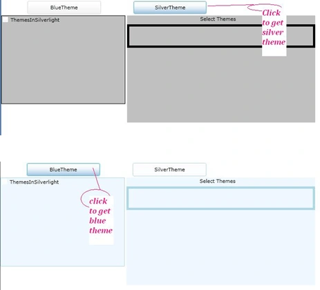
Output look like as below,
Summary : We can create custom themes in silverlight.
Dea SaddlerPosted Aug 22, 2011, 7:29 AM
Nice Article Priya........