
In this article we will check out how to create fancy buttons in Silverlight.
We will creating a Elastic Button i.e. a button with an Elastic effect.
In this article we would see how we can apply an elastic effect to the
Silverlight Buttons.
Let me give you a picture of how the Button should look like:

Below is the Style which I am trying to apply to the button
I added few states in the VisualStateManager. To know more about the
VisualStateManager please check out this link
http://msdn.microsoft.com/en-us/library/system.windows.
visualstatemanager(v=vs.95).aspx
Below is how I have used the VisualStateManager.
<VisualStateManager.VisualStateGroups>
<VisualStateGroup
x:Name="CommonStates">
<VisualStateGroup.Transitions>
<VisualTransition
From="MouseOver"
GeneratedDuration="0:0:0.2"
To="Normal"/>
<VisualTransition
From="Pressed"
GeneratedDuration="0:0:0.1"
To="MouseOver"/>
<VisualTransition
From="Pressed"
GeneratedDuration="0:0:0.1"
To="Normal"/>
</VisualStateGroup.Transitions>
<VisualState
x:Name="Disabled"/>
<VisualState
x:Name="Normal"/>
<VisualState
x:Name="MouseOver">
<Storyboard>
<DoubleAnimationUsingKeyFrames
Storyboard.TargetProperty="(UIElement.RenderTransform).(CompositeTransform.ScaleX)"
Storyboard.TargetName="Grid">
<EasingDoubleKeyFrame
KeyTime="0:0:0.1"
Value="0.9"/>
<EasingDoubleKeyFrame
KeyTime="0:0:0.3"
Value="1.1"/>
</DoubleAnimationUsingKeyFrames>
<DoubleAnimationUsingKeyFrames
Storyboard.TargetProperty="(UIElement.RenderTransform).(CompositeTransform.ScaleY)"
Storyboard.TargetName="Grid">
<EasingDoubleKeyFrame
KeyTime="0:0:0.1"
Value="0.9"/>
<EasingDoubleKeyFrame
KeyTime="0:0:0.3"
Value="1.1"/>
</DoubleAnimationUsingKeyFrames>
</Storyboard>
</VisualState>
<VisualState
x:Name="Pressed">
<Storyboard>
<DoubleAnimation
Duration="0:0:0.1"
To="1.023"
Storyboard.TargetProperty="(Shape.Fill).(RadialGradientBrush.RadiusY)"
Storyboard.TargetName="Rectangle"
d:IsOptimized="True"/>
<DoubleAnimation
Duration="0:0:0.1"
To="0.914"
Storyboard.TargetProperty="(Shape.Fill).(RadialGradientBrush.RadiusX)"
Storyboard.TargetName="Rectangle"
d:IsOptimized="True"/>
</Storyboard>
</VisualState>
</VisualStateGroup>
</VisualStateManager.VisualStateGroups>
Notice the Pressed State :
<VisualState
x:Name="Pressed">
<Storyboard>
<DoubleAnimation
Duration="0:0:0.1"
To="1.023"
Storyboard.TargetProperty="(Shape.Fill).(RadialGradientBrush.RadiusY)"
Storyboard.TargetName="Rectangle"
d:IsOptimized="True"/>
<DoubleAnimation
Duration="0:0:0.1"
To="0.914"
Storyboard.TargetProperty="(Shape.Fill).(RadialGradientBrush.RadiusX)"
Storyboard.TargetName="Rectangle"
d:IsOptimized="True"/>
</Storyboard>
</VisualState>
There is a Double Animation, that I have created, targeting the Radius of the
Rectangle.
I want to create a shadow effect for the Button as shown below:
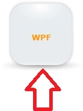
I achieved that by creating an ellipse. The XAML is shown below:
<Ellipse
Opacity="0.495"
StrokeThickness="0"
Height="17"
VerticalAlignment="Bottom">
<Ellipse.Effect>
<BlurEffect/>
</Ellipse.Effect>
<Ellipse.Fill>
<RadialGradientBrush
RadiusY="0.46"
RadiusX="0.46"
GradientOrigin="0.475,0.5">
<GradientStop
Color="#FF6A6A6A"
Offset="0"/>
<GradientStop
Color="#006A6A6A"
Offset="0.863"/>
</RadialGradientBrush>
</Ellipse.Fill>
</Ellipse>
And then Finally the rectangle which would
Represent the Button is shown below :
<Rectangle
Margin="30,0,31,8"
RadiusY="21"
RadiusX="21"
Fill="#FF454444"
Opacity="0.25">
<Rectangle.Effect>
<BlurEffect/>
</Rectangle.Effect>
</Rectangle>
<Rectangle
Margin="31,1,32,9"
RadiusY="21"
RadiusX="21">
<Rectangle.Fill>
<LinearGradientBrush
EndPoint="0.502,1.261"
StartPoint="0.5,0">
<GradientStop
Color="#FFE8EDF1"/>
<GradientStop
Color="White"
Offset="0.836"/>
<GradientStop
Color="#FFE8EDF1"
Offset="0.757"/>
</LinearGradientBrush>
</Rectangle.Fill>
</Rectangle>
<Rectangle
x:Name="Rectangle"
Margin="31,1,32,9"
RadiusY="21"
RadiusX="21">
<Rectangle.Fill>
<RadialGradientBrush
RadiusY="0.411"
RadiusX="0.641"
Center="0.496,0.048"
GradientOrigin="0.496,0.048">
<GradientStop
Color="White"
Offset="0"/>
<GradientStop
Color="#00E8EDF1"
Offset="1"/>
<GradientStop
Color="#7CE8EDF1"
Offset="0.681"/>
</RadialGradientBrush>
</Rectangle.Fill>
</Rectangle>
How to use the Style?
The XAML for using the Style on the Button is shown below:
<Button
Content="Silverlight"
HorizontalAlignment="Left"
Height="97"
Margin="8,35,0,0"
Style="{StaticResource
ElasticButtonStyle}"
VerticalAlignment="Top"
Width="150"/>
Please find the source code attached.
Join the conversation! Your thoughts help the community grow.