

Introduction
In this article, we will learn how to provide a Stitched effect using CSS. First, we apply the Stitched effect to a simple box (in other words any div), then we add some background-images and take this trick to the next level.
Let's Begin
Example 1
HTML Structure
<div class="stitched">Stitched</div>
CSS
- .stitched
- {
- background-color:darkred;
- width:200px;
- font-size:20px;
- color:white;
- padding:20px;
- }
Here we set the background-color, width, font-size and so on of the div using the ".stitched" class.
Preview

- .stitched
- {
- background-color:darkred;
- width:200px;
- font-size:20px;
- color:white;
- padding:20px;
- border:2px dashed white;
- border-radius:20px;
- box-shadow:0px 0px 4px 4px darkred;
- }
We have now added a border, border-radius and box-shadow to the ".stitched" class. In the box shadow, we only use blur and spread and set the value to "4px" (box-shadow syntax: box-shadow: h-shadow v-shadow blur spread color).
Preview
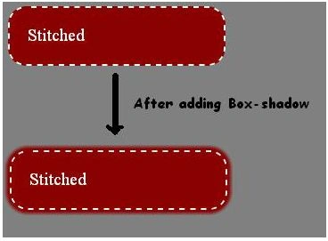
That example was a basic example of a stitched effect. Now we will create another Stitched effect.
- <div class="pic">
- <div class="borderdiv">
- <div class="inner"><p class="text1">Stitched</p></div>
- </div>
- </div>
Here, the outermost div (".pic") sets the background-image and middle (".borderdiv") to set the border and give a stitched look and innermost div (".inner") for the text and so on.
CSS
- .pic
- {
- background-image:url("white_leather.png");
- width:302px;
- height:202px;
- border-radius:5px;
- }
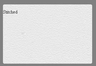
Here, I set the background-image, width, height and border-radius.
Preview
- .borderdiv
- {
- width:280px;
- height:180px;
- border: 2px dashed #aaa;
- border-radius:10px;
- position:relative;
- top:9px;
- left:10px;
- box-shadow: 0 0 0 1px #f5f5f5;
- }
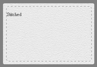
Here, we set the width and height less than the ".pic" so that it remains inside it. Then, we set the border, border-radius and box-shadow to provide the Stitched effect. Using position, we adjust the position to inside the div (".pic").
Preview
- .text1
- {
- margin-top:60px;
- text-align:center;
- font-size:50px;
- color:gray;
- }
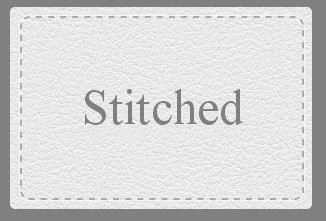
Here we adjust the font-size, color, align and so on.
Preview (Final)
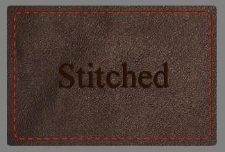
I have created some other examples using the same technique. You can download them for viewing or using.
Gakenh01Posted Jan 27, 2014, 1:43 PM
Little use for this. Everyone that knows CSS knows about dashed lines.