

Silverlight ToolTip Control
A ToolTip is a pop-up window that displays some information in a small window. The ToolTip class in .NET 3.5 represents a ToolTip. This article demonstrates how to create and use a ToolTip control by using XAML and C#.
Creating a ToolTip
The ToolTip element represents a ToolTip control in XAML.
<ToolTip/>
The IsOpen property represents if a ToolTip is visible or not. The HorizontalOffset and VerticalOffset properties represent the horizontal and vertical distance between the target control and the pop-up window. The Content property represents the contents of the ToolTip.
The code snippet in Listing 1 creates a ToolTip control and sets the horizontal offset, vertical offse and content of a ToolTip control.
<ToolTip Content="Hello! I am a ToolTip."
HorizontalOffset="10" VerticalOffset="20"/>
Listing 1
The output looks like Figure 1.

Figure 1
ToolTip Service
To display a tooltip for a control, the ToolTipService class must be used. The SetToolTip and GetToolTip static methods are used to set and get the tooltip of a control.
The following code snippet creates a ToolTipService.ToolTip for a control.
<ToolTipService.ToolTip >
<ToolTip Content="Hello! I am a ToolTip."
HorizontalOffset="10" VerticalOffset="20"/>
</ToolTipService.ToolTip>
Listing 2
The code snippet in Listing 3 sets a ToolTip of a Button control.
<Button Content="Mouse over me" Width="150" Height="30"
Canvas.Top="10" Canvas.Left="10">
<ToolTipService.ToolTip >
<ToolTip Content="Hello! I am a ToolTip."
HorizontalOffset="10" VerticalOffset="20"/>
</ToolTipService.ToolTip>
</Button>
Listing 3
The new if you run the application and mouse over the button control, the output looks like Figure 2.

Figure 2
Creating a Fancy Tooltip
The ToolTip content can be any control and multiple controls. The code snippet in Listing 4 creates a ToolTip with an image and text in it.
<!-- Create a button -->
<Button Content="Mouse over me" Width="150" Height="30"
Canvas.Top="50" Canvas.Left="20">
<!-- Create a tooltip by using the ToolTipService -->
<ToolTipService.ToolTip >
<ToolTip HorizontalOffset="0" VerticalOffset="0">
<!-- Add a StackPanel to the tooltip content -->
<StackPanel Width="250" Height="150">
<!-- Add an image -->
<StackPanel.Background>
<ImageBrush ImageSource="Garden.jpg"
Opacity="0.4"/>
</StackPanel.Background>
<!-- Add a text block -->
<TextBlock >
<Run Text="This is a tooltip with an image and text"
FontFamily="Georgia" FontSize="14" Foreground="Blue"/>
</TextBlock>
</StackPanel>
</ToolTip>
</ToolTipService.ToolTip>
</Button>
Listing 4
The new tooltip looks like Figure 3.
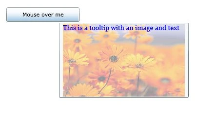
Figure 3
Summary
In this article, I discussed how we can add a tooltip to a control in Silverlight.
Join the conversation! Your thoughts help the community grow.