

Today, I am creating another new post in which I am going to tell you how to customize the button in Xamarin.Forms. So, let's start.
We will first create a class with a name as "CustomLabel" and then, we will write a code in C #.
- public class CustomLabel : Label
- {
- public static readonly BindableProperty CurvedCornerRadiusProperty =
- BindableProperty.Create(
- nameof(CurvedCornerRadius),
- typeof(double),
- typeof(CustomLabel),
- 12.0);
- public double CurvedCornerRadius
- {
- get { return (double)GetValue(CurvedCornerRadiusProperty); }
- set { SetValue(CurvedCornerRadiusProperty, value); }
- }
- public static readonly BindableProperty CurvedBackgroundColorProperty =
- BindableProperty.Create(
- nameof(CurvedCornerRadius),
- typeof(Color),
- typeof(CustomLabel),
- Color.Default);
- public Color CurvedBackgroundColor
- {
- get { return (Color)GetValue(CurvedBackgroundColorProperty); }
- set { SetValue(CurvedBackgroundColorProperty, value); }
- }
- }
Now, we can write some code in Android project for setting the radius and background color.
- [assembly: ExportRenderer(typeof(CustomLabel), typeof(CurvedLabelRenderer))]
- namespace XYZApp.Droid
- {
- public class CurvedLabelRenderer : LabelRenderer
- {
- private GradientDrawable _gradientBackground;
- protected override void OnElementChanged(ElementChangedEventArgs<Label> e)
- {
- base.OnElementChanged(e);
- var view = (CustomLabel)Element;
- if (view == null) return;
- // creating gradient drawable for the curved background
- _gradientBackground = new GradientDrawable();
- _gradientBackground.SetShape(ShapeType.Rectangle);
- _gradientBackground.SetColor(view.CurvedBackgroundColor.ToAndroid());
- // Thickness of the stroke line
- _gradientBackground.SetStroke(4, view.CurvedBackgroundColor.ToAndroid());
- // Radius for the curves
- _gradientBackground.SetCornerRadius(DpToPixels(this.Context,
- Convert.ToSingle(view.CurvedCornerRadius)));
- // set the background of the label
- Control.SetBackground(_gradientBackground);
- }
- //Px to Dp Conver
- public static float DpToPixels(Context context, float valueInDp)
- {
- DisplayMetrics metrics = context.Resources.DisplayMetrics;
- return TypedValue.ApplyDimension(ComplexUnitType.Dip, valueInDp, metrics);
- }
- }
- }
Then, we will create the same in iOS project also.
- [assembly: ExportRenderer(typeof(CustomLabel), typeof(CurvedLabelRenderer))]
- namespace XYZApp.iOS
- {
- public class CurvedLabelRenderer : LabelRenderer
- {
- protected override void OnElementChanged(ElementChangedEventArgs<Label> e)
- {
- base.OnElementChanged(e);
- if (e.NewElement != null)
- {
- var _xfViewReference = (CustomLabel)Element;
- this.Layer.CornerRadius = (float)_xfViewReference.CurvedCornerRadius;
- this.Layer.BackgroundColor = _xfViewReference.CurvedBackgroundColor.ToCGColor();
- }
- }
- }
- }
Now, again, please make sure to add a view reference.....
xmlns:local="clr-namespace:CustomLabelApp"
Then, write the XAML code in main page.
- <StackLayout Padding="20">
- <control:CustomLabel FontSize="14.5"
- CurvedBackgroundColor="#6DB040"
- TextColor="White"
- Text="Custom Label"
- HorizontalOptions="FillAndExpand"
- CurvedCornerRadius="16"
- HeightRequest="40"
- VerticalTextAlignment="Center"
- HorizontalTextAlignment="Center"/>
- <Label Text="Simple Label"
- HeightRequest="40"
- VerticalTextAlignment="Center"
- BackgroundColor="Gray"
- HorizontalTextAlignment="Center"/>
- </StackLayout>
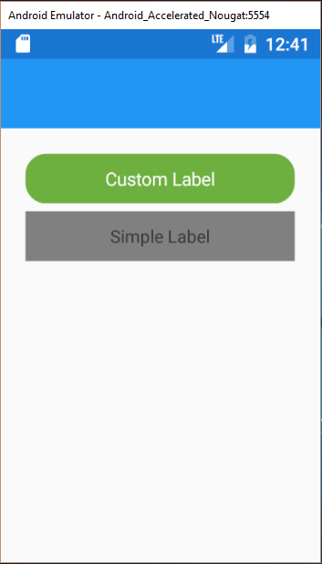
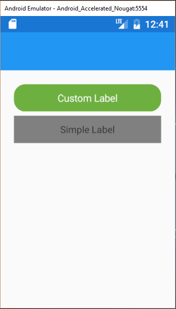
You should have your Custom Label working!!
Features of CustomLabel controls
- Custom Curved Background Color Property=(CurvedBackgroundColor="#24C4FF")
- Custom Curved Corner Radius Property=(CurvedCornerRadius="4")
For complete source code, click here.
Join the conversation! Your thoughts help the community grow.