Loading
Topic
Media Queries
9 posts about Media Queries by 8 contributors.
Know Media Queries? Share what you know with developers who are learning it.
+ Follow Media QueriesBe the first to follow this
- Articles
- 9
- Contributors
- 8
Everything about Media Queries
- Article · Learn iOS Programming
How Do Developers Design Responsive Interfaces That Adapt to Different Devices?
Learn how developers craft responsive interfaces that seamlessly adapt to diverse devices. Master flexible layouts, media queries, and mobile-first design for optimal UX.
- Article · Bootstrap
Bootstrap For Beginners - Part Two (Bootstrap Containers)
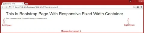
This article explores Bootstrap containers, focusing on the two main classes: .container for a responsive fixed-width layout and .container-fluid for a full-width layout. It provides practical examples to illustrate how to create interactive, responsive website designs using these classes.
- Article · .NET
Change Grid Size Dynamically Based on Screen Resolution
Learn how to create responsive web layouts by dynamically adjusting grid sizes based on screen resolution. Explore techniques using CSS media queries to adapt grid layouts for various viewport sizes.
- Article · HTML 5
Building a Responsive Website Template: HTML5 & CSS3 Media Queries
In this article, I'll explain the nuts and bolts of responsive web designing and media queries. What? When? Why? I'll explain these questions in this article.
- Article · HTML 5
Media Queries For Mobile, Laptop, Desktop And iPad For Making Responsive Website Design
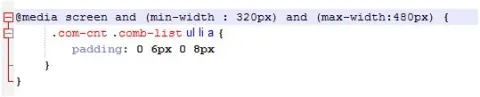
Media queries enable responsive web design by adapting layouts based on device characteristics like screen size. Tailoring designs for mobile, laptop, desktop, and iPad ensures optimal user experience across various devices and viewport dimensions.
- Article · HTML 5
Media Queries in CSS
This article elucidates the significance and functionalities of media queries, a prominent module of CSS3. It highlights how CSS3 introduces a plethora of built-in modules, including media queries, that empower designers to enhance media, graphics, and animation in web pages and applications.
- Article · HTML 5
Responsive Web Design Using Media Queries
Responsive web design utilizes media queries to adapt layouts and styles based on the user's device characteristics, such as screen size and orientation. This ensures optimal viewing experience across various devices, enhancing usability and accessibility.
- Article · HTML 5
Responsive Website Design Using Media Queries
Create responsive website designs with media queries, adapting layouts and styles based on device characteristics like screen size and orientation. Optimize user experience across various devices through targeted CSS adjustments, ensuring seamless interaction and readability.
- Article · Web Development
Elements Of Responsive Web Design
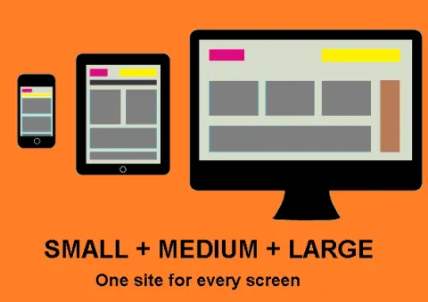
Responsive web design ensures that users can access a website effortlessly, whether they are using a desktop computer, laptop, tablet, or smartphone. By dynamically adjusting the layout and content presentation, responsive design enhances readability, navigation, and overall user satisfaction.