Gantt Chart
1 post1 contributor
+ FollowBe the first to follow this
Write about itArticles about Gantt Chart

Create Gantt Chart To Show Duration Between Start Time And End Time Using R Within Power BI
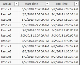
This article covers how we can create a Gantt Chart using R script visualization. A Gantt chart is used to represent the duration between a start time and end time. Here, I have created a Gantt Chart to represent the time between start time and end time in hours.