Loading
Topic
Viewport
3 posts about Viewport by 3 contributors.
Know Viewport? Share what you know with developers who are learning it.
+ Follow ViewportBe the first to follow this
- Articles
- 3
- Contributors
- 3
Everything about Viewport
- Article · HTML 5
Responsive Web Design Using Media Queries
Responsive web design utilizes media queries to adapt layouts and styles based on the user's device characteristics, such as screen size and orientation. This ensures optimal viewing experience across various devices, enhancing usability and accessibility.
- Article · WPF
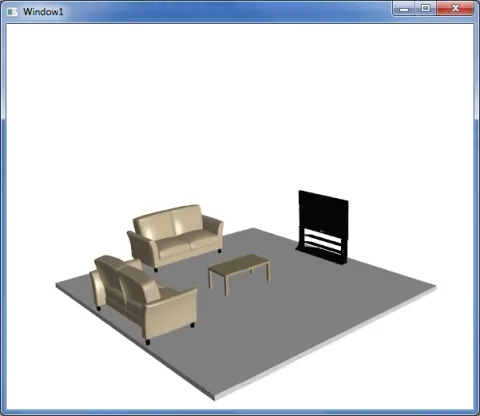
Creating a simple 3D scene in WPF
In this article I will use the premise of creating a simple 3D scene in WPF.