Loading
Articles by Mahesh Chand

XAML Label Code Example
The <Label> element in XAML represents a Label control. This article shows how to use a Label control in WPF using XAML and C#.
Display Image In WPF using XAML and C#
The Image class represents the WPF Image control that is used to display images in WPF. The <Image> element of XAML is used to create the Image control at design-time. The code example in this article shows how to use a WPF Image control do display and manipulate images using C# and XAML.

Using WPF GroupBox in C# and XAML
Learn how to create and style a WPF GroupBox in XAML and C#, including headers, borders, and layouts containing multiple controls.
Using XAML Grid Panel
The <Grid> element in XAML represents a grid panel that provides a grid layout. The code example in this article shows how to use a Grid panel at design time using XAML in a WPF app.
Working with WPF Frame using C# and XAML
The Frame class in C# and the <Frame> element in XAML represent a Frame windows control at run-time and design-time respectively. The code examples in this article demonstrate how to use a Frame control in a WPF app using XAML and C#.
Working with WPF Expander Control using C# and XAML
The Expander class in C# represents a WPF Expander control. At design time, the <Expander> element of XAML is used to create an Expander control. The code examples in this tutorial demonstrate how to use an expander control in a WPF app.
XAML DatePicker
The XAML <DatePicker> element represents a DatePicker control in UI app. This article demonstrates how to use a DatePicker control in WPF app.
Future of WPF
What is the future of WPF? Watch the following video in which two Visual Studio program managers at Microsoft, Unni and Hari, talk about the future of WPF, XAML, Blend and much more.
XAML ComboBox
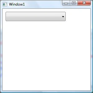
The <ComboBox> element in XAML represents a ComboBox. This article demonstrates how to create and use a ComboBox using XAML.
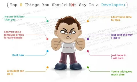
Top 8 Things You Should Not Say To a Developer
List of 8 things you probably should not say to a developer.
XAML CheckBox
The XAML <CheckBox> element represents a CheckBox control. Code example to create and use a CheckBox using XAML in a WPF app.
XAML Calendar
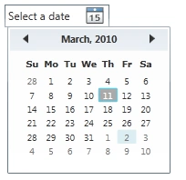
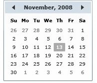
The XAML <Calendar> element represents a WPF calendar. XAML Calendar provides a calendar control to select a date or a date range from a month view. This tutorial with code examples details how to use a calendar control in WPF.
XAML Button
The Button class represents a button control of WPF in C#. Button control is created using the <Button> element in XAML at design-time. The code examples in this Button tutorials show how to create a button, add a click event handler to a button, and format a WPF button in C# and XAML.
XAML Border
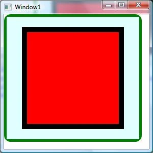
The XAML <Border> element represents a border in Windows app. Code example in this tutorial shows how to apply a border to WPF controls using XAML and C#.



What is New in ASP.Net 5
Scott Hunter talks more about the modern web, ASP.NET 5 and Visual Studio 2015.

What is New in Visual Basic 14
Visual Basic 14 was just announced as a part of Visual Studio 2015 and .NET 2005. Check out the new features in this video.
Mastering WPF DataGrid in a Day: Hour 8 CRUD Using DataGrid
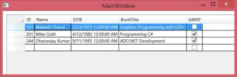
In this Hour 8 part of the Mastering WPF DataGrid in a Day series, I will demonstrate how to use CRUD operations in a DataGrid.
Mastering WPF DataGrid in a Day: Hour 7 Data Template
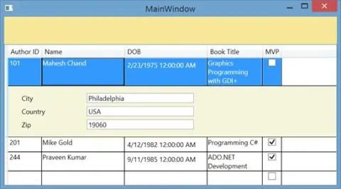
In my last article, we saw how to work with the DataGrid columns. In this Hour 7 part of Mastering WPF DataGrid in a Day series, I will cover the use of a data template in a DataGrid.
Mastering WPF DataGrid in a Day: Hour 6 DataGrid Columns In-Depth
In my last article, I demonstrated how to use some of the basic columns functionality. In this Hour 6 part of Mastering WPF DataGrid in a Day series, I will cover some of the advanced functionality of DataGrid columns.
Mastering WPF DataGrid in a Day: Hour 5 DataGrid Columns
In this Hour 5 part of the Mastering WPF DataGrid in a Day series, I will talk about the DataGrid columns and review column properties.
Key To Success - Continuity
Learn why continuity, sustained effort, and persistence matter more than quick achievements for long-term career and personal success.
Mastering WPF DataGrid in a Day: Hour 4 DataGrid Rows
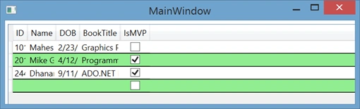
This article of the Mastering WPF DataGrid series explains the DataGrid row header and rows visibility, row appearance and a few other properties.