Loading
Everything in CSS
Tailwind CSS Header and Seamlessly Integrating It with ReactJS
Tailwind CSS is a utility-first CSS framework that enables rapid UI development with minimal custom CSS. It provides a wide array of predefined classes, allowing developers to style directly in their HTML. Tailwind is highly customizable, supports responsive design, and offers performance optimization features.
Learn CSS Frameworks Structure
This article explores CSS frameworks and front-end architecture, highlighting modular design, functional CSS systems like Tailwind and Bulma, and best practices for consistency and performance. It compares traditional CSS methodologies with modern utility-first approaches, providing examples and insights.
CSS Theming Using Variables and JavaScript
Discover how to enhance your web design with CSS theming using variables and JavaScript. Learn how to create dynamic and customizable themes by leveraging CSS custom properties and JavaScript for real-time style changes.
CSS Image Opacity/Transparency
This article covers how to create transparent images and text boxes using CSS. It demonstrates using the 'opacity' property for images and hover effects, and shows how to place text in a semi-transparent box.
Overflow Property With Auto Value in CSS
The article walks through creating a div with HTML and CSS, applying the overflow property, and demonstrating how the auto value displays scrollbars when necessary, ensuring a responsive design.
How to Use Absolute Position Property in CSS
In this article, you'll learn how to position an image as a background using the Z-index property in CSS. We start by designing a header with a title in a div container, then create a main body div, insert an image, and finally use the Z-index to layer the image behind other content, making it appear as a background.
Using CSS Pseudo-Class
This article explains how to apply CSS Pseudo-classes with text-decoration to enhance navigation bars. Learn to use a:link, a:hover, a:visited, and a:active to style links dynamically.
Creating a Three Dot Loading Animation
Creating a three-dot loading animation using HTML and CSS. The HTML sets up a container with three dots, while the CSS styles the dots and applies a blinking animation using Flexbox for centering and keyframes for the animation effect. The staggered animation delay creates a sequential blinking effect.
CSS Combinator Selectors
Helps you to get started learning the advanced concept of CSS combinator selectors such as child, adjacent sibling, and general sibling.
Vertical Drop Down Menu on Hover Using CSS and HTML
This article guides you through creating a Vertical Drop Down Menu using HTML and CSS. You'll start by adding a div element with nested lists for the menu structure. The CSS styles control layout, positioning, and hover effects to create an interactive and visually appealing vertical menu.
A Simple Animation of Microsoft New Logo in CSS3
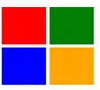
Learn how to create animated logos using CSS3 keyframes. This tutorial guides you through defining animations for HTML div elements, configuring keyframe sequences for transitions, and implementing browser-specific syntax for compatibility with Chrome, Safari, Firefox, and Opera.
Flipping div in CSS
In this article, we will see how we can flip div cards. On creating flipping div cards are well-structured and easy to follow, making it accessible for readers with different levels of expertise. It provides a comprehensive guide on how to set up and style flipping div cards using HTML and CSS.
how to make a sidebar mobile friendly
i am a react app using next js and i stuct to some where. i am using tailwind css.its a css related issue.on page load my cart should not display so i hide to the right using translate-x-full on click to cart button i showed to add a class translate-x-0. on laptop its looks fine and working fine but when shited to mobile devies on chrome.this side bar is displaying on the right. i don't know how to fix this issue. My full code is:its a navbar component code with all imports: import React, { useRef } from 'react' import Link from 'next/link' import { CiShoppingCart } from "react-icons/ci"; import { IoCloseCircleOutline } from "react-icons/io5"; import { FaCirclePlus } from "react-icons/fa6"; import { FaCircleMinus } from "react-icons/fa6"; const Navbar = () => { let ref=useRef(); let toggleCart=()=> { if(ref.current.classList.contains("translate-x-full")) { ref.current.classList.remove("translate-x-full"); ref.current.classList.add("translate-x-0"); } else if(!ref.current.classList.contains("translate-x-full")){ ref.current.classList.remove("translate-x-0"); ref.current.classList.add("translate-x-full"); } } return ( <div className='flex flex-col md:flex-row md:justify-start justify-center items-center py-4'> &
Understanding CSS Grid: Building a Responsive Layout
Illustrating the application of CSS Grid to construct a responsive webpage layout. Through precise grid definitions and item placements, it delineates sections like header, sidebar, content, and footer.
CSS :has() unleashed
Learn how to use the CSS :has() relational pseudo-class to style elements based on their descendants and siblings, with examples, browser support, limitations, and performance considerations.
HTML textselection end marker disappears
Anybody know why text selection endpoint disappears when my selection comes to the start of the next line
Click Event Not Accurate in Mobile
There is a strange issue as I have a mobile application running on simple Javascript and I have a case were an icon is visible upon a certain condition and there is a click event on that icon but somehow the click position is not accurate, when I click around that icon then it fires so upon clicking 5-7 times on that icon it fires and when I debug through developer tools it works on accurate position. My Icon is in Div and when I change the div to span in developer tools it works as expected When I change this div to span and deploy again it does not work so the thing is that when I change div and span at run time in developer tools it starts working as expected. can anyone help me here?
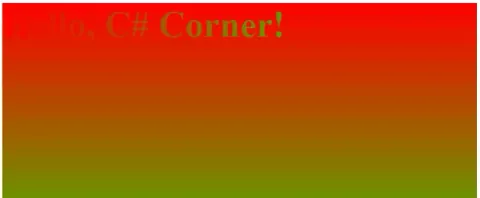
Gradient Effect Using CSS
CSS gradients are a powerful tool for creating smooth transitions between two or more colors.
CSS Border Property in HTML: Part I
The CSS border properties allow you to specify the style and color of an element's border.
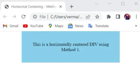
5 Effective Methods to Center a DIV in CSS
Master the art of centering divs and elements in CSS with our comprehensive guide. Explore 5 techniques including margin auto, flexbox, grid, absolute positioning, and transforms. Position your designs to perfection today.
Top CSS Features You Should Know
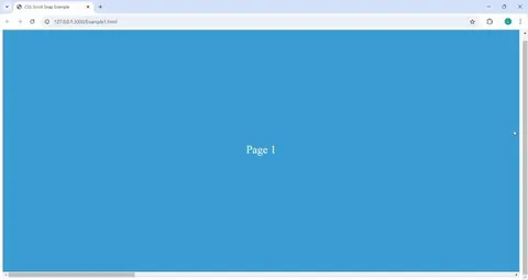
Explore the top CSS features you need to know for creating modern and engaging web designs. This comprehensive blog covers essential features like clamp(), smooth scrolling, Scroll Snap, inset positioning, order manipulation, display properties, min/max values, text truncation with line-clamp, :has and :is pseudo-classes, with practical examples for each feature. Enhance your CSS skills and unlock the full potential of styling your web pages!
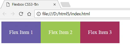
Flexbox Vs CSS Grid For Responsive Designing
Creating responsive and dynamic layouts is a crucial aspect of modern web development. With the advent of Flexbox and CSS Grid, CSS layout techniques have evolved to provide developers with powerful tools to build flexible and responsive designs
CSS Selectors
Learn how to write CSS selectors for web elements in this informative article. Discover various selector techniques and syntax examples for efficient and effective automation testing.